
Extracurriculars
cuHacking
cuHacking is Carleton University’s official hackathon, originally launched in 2016 as an annual event that brought together students from all fields to collaborate, learn, and innovate. After a pause during the pandemic, when the original organizers graduated, the event was revived in 2025, marking a new chapter for the Carleton tech community. Over three days, participants team up to design and build creative solutions to real-world challenges proposed by the hackathon or its sponsors; celebrating creativity, collaboration, and the spirit of innovation.
Role
Co-lead
UX/UI Designer
Tools
Figma
FigJam
Team
Hairou (ux/ui)
Khy (ux/ui)
Avantika (ux/ui)
Farabi (dev)
Hasith (dev)
Deliverables
Design System
Sponsorship Package
Social Media Builder
Website
Hacker Portal
Design Problem
The existing cuHacking brand felt outdated and failed to set the event apart from other Carleton clubs, making it difficult to capture the energy and innovation of a modern hackathon.
HOW Might WE
design a cohesive identity system that captures cuHacking’s innovative energy while staying accessible and easy to maintain across print, web, and digital touchpoints?
./01
Research and Discovery
Previous Identity
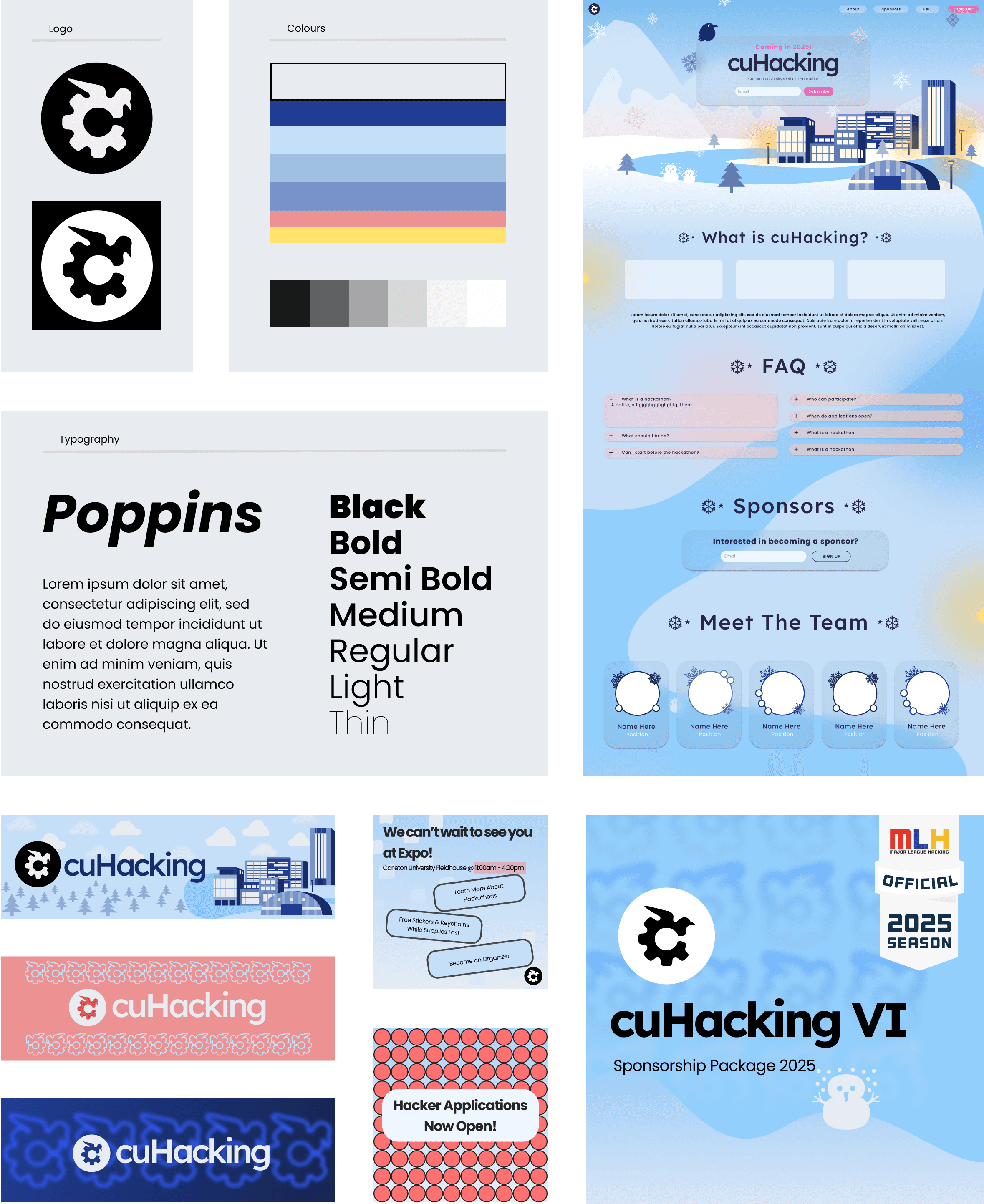
The previous cuHacking identity (used in 2024) focused heavily on repeating geometric visuals and blurs. While it carried energy, it didn’t reflect the interactivity and openness of the current cuHacking community.
Visual Audit
Brand
The previous identity relied on winter-themed visuals (snowflakes, frosted gradients, cool blues), which no longer aligns with cuHacking as the event happened in spring. The typeface Poppins, while clean and modern, is widely used and did not give the brand a distinct voice or character.
Logo
The logo combined a raven (Carleton mascot) and a gear (technology symbol). However, the gear suggested a mechanical / industrial focus, which doesn’t reflect the types of projects built at cuHacking. The raven shape is an overused Carleton motif and didn't differentiate us from other campus clubs,
Consistency
Lacked cohesion across platforms. Every deliverable; from the website to banners to social media posts, looked visually disconnected. Colors, typography, and layouts were applied differently in each context, making the brand feel fragmented and inconsistent rather than unified.
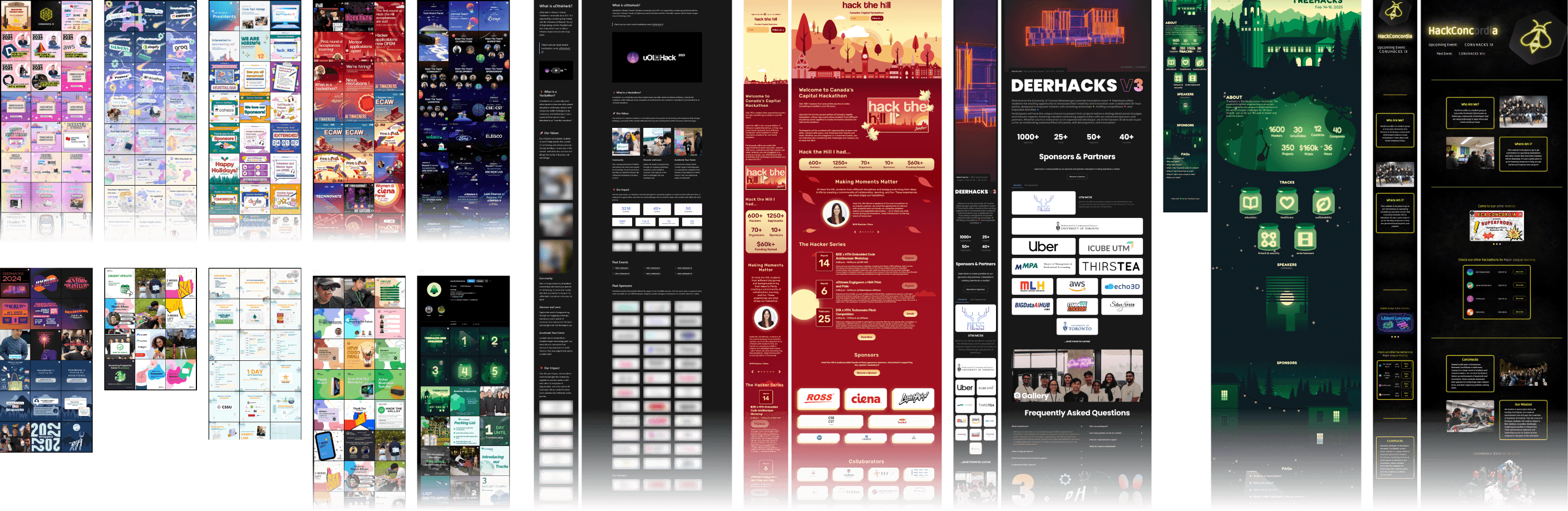
Inspiration from Other Hackathons
To redefine cuHacking’s visual direction, we studied other hackathons to understand how they express energy, accessibility, and innovation through branding. We looked over their Instagram grids, websites and portals.
Internal Surveys & Questions
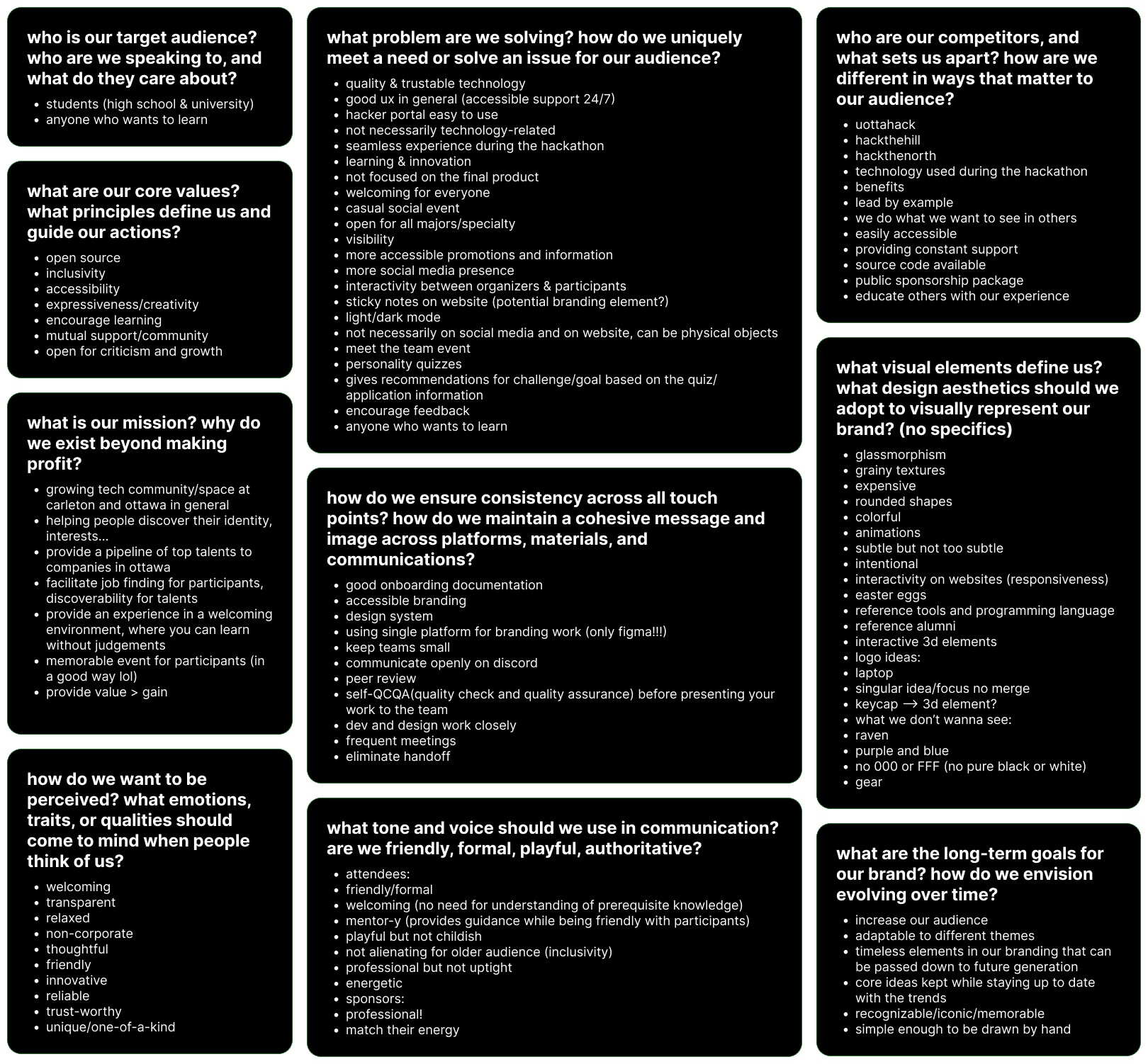
To align the new branding with the team’s vision, we conducted short internal discussions and surveys with organizers, designers, and developers. The goal was to understand how everyone perceived cuHacking’s identity and what they wanted the brand to express moving forward.
Key findings
Values
Inclusivity, accessibility, open-source spirit, creativity, and community.
Audience
Students (high school & university).
Mission
Create a welcoming space for hands on learning, growth, and collaboration, not just competition.
Tone
Friendly, approachable, and professional; playful but not childish.
Visuals
Glassmorphism, color, interactivity, and 3D. Avoid ravens, gears, and corporate blues.
Consistency
Centralized design system and Figma-based workflow.
./02
Brand Identity
Logo Exploration
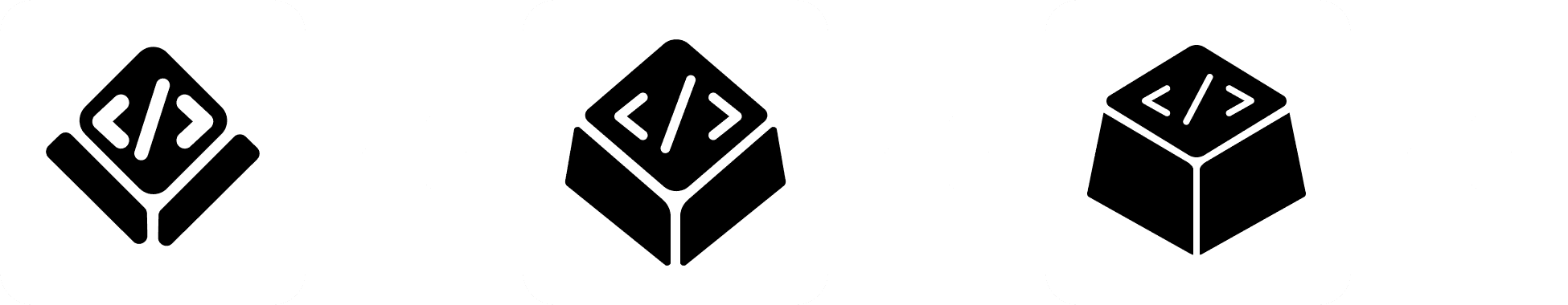
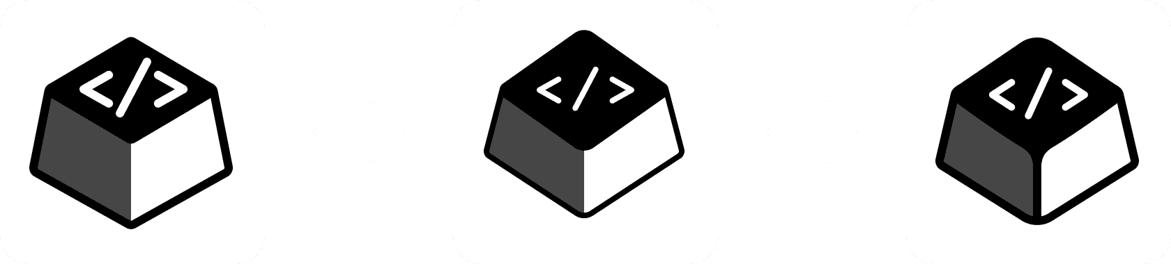
We began with wide exploratory sketches, experimenting with symbols related to hacking, communication, circuitry, collaboration, and digital identity. With each iteration, we removed visuals that didn't fit the image of cuHacking we had discussed during the the research and discovery phase.
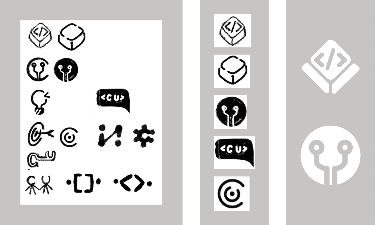
Iterations by Hairou
Why The Keycap?
As we refined, the keyboard key shape stood out. It represents:
Hands-on creativity
Making things by typing, building, testing, learning.
Universality
Every participant, regardless of skill level, interacts through a keyboard.
Interactivity
Reinforces the tactile, “jump in and build” spirit of cuHacking.
Color Exploration
We started by creating color mood boards to explore how different palettes could shape cuHacking’s identity and overall tone. Mood boards helped us visualize the kind of atmosphere we wanted to create, something that felt technical, modern, and hands-on.
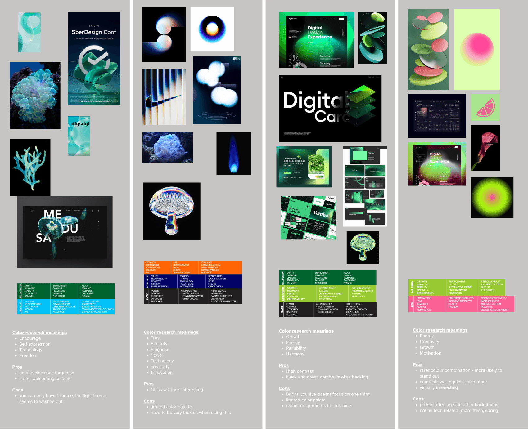

Final MoodBoard
When developing cuHacking’s new visual identity, we explored a range of color mood boards before ultimately leaning toward a green palette reminiscent of old computer terminals; black backgrounds paired with glowing green text. This choice captured the nostalgic, tech-driven spirit of hacking while introducing a clean, modern edge.
The keyboard-inspired logo naturally complemented this theme, reinforcing a grounded, technical aesthetic. To support our decision, we conducted color psychology research, finding that this combination of green and black evokes qualities like encouragement, safety, growth, education, and discipline, all values central to cuHacking’s mission of learning and innovation.
This page is a work in progress! Stay tuned